Two Great User Interfaces
On his Surprisingly Free podcast last week, Jerry Brito had a great interview with Chicago law professor Joseph Isenbergh about the competition between open and closed systems. As we’ve seen, there’s been a lot of debate recently about the iPhone/Android competition and the implications for the perennial debate between open and closed technology platforms. In the past I’ve come down fairly decisively on the “open” side of the debate, criticizing Apple’s iPhone App Store and the decision to extend the iPhone’s closed architecture to the iPad.
In the year since I wrote those posts, a couple of things have happened that have caused some evolution in my views: I used a Linux-based desktop as my primary work machine for the first time in almost a decade, and I switched from an iPhone to a Droid X. These experiences have reminded me of an important fact: the user interfaces on “open” devices tend to be terrible.
The power of open systems comes from their flexibility and scalability. The TCP/IP protocol stack that powers the Internet allows a breathtaking variety of devices—XBoxen, web servers, iPhones, laptops and many others— to talk to each other seamlessly. When a new device comes along, it can be added to the Internet without modifying any of the existing infrastructure. And the TCP/IP protocols have “scaled” amazingly well: protocols designed to connect a handful of universities over 56 kbps links now connect billions of devices over multi-gigabit connections. TCP/IP is so scalable and flexible because its designers made as few assumptions as possible about what end-users would do with the network.
These characteristics—scalability and flexibility—are simply irrelevant in a user interface. Human beings are pretty much all the same, and their “specs” don’t really change over time. We produce and consume data at rates that are agonizingly slow by computer standards. And we’re creatures of habit; once we get used to doing things a certain way (typing on a QWERTY keyboard, say) it becomes extremely costly to retrain us to do it a different way. And so if you create an interface that works really well for one human user, it’s likely to work well for the vast majority of human users.
The hallmarks of a good user interface, then, are simplicity and consistency. Simplicity economizes on the user’s scarce and valuable attention; the fewer widgets on the screen, the more quickly the user can find the one she needs and move on to the next step. And consistency leverages the power of muscle memory: the QWERTY layout may have been arbitrary initially, but today it’s supported by massive human capital that dwarfs whatever efficiencies might be achieved by switching to another layout.
To put it bluntly, the open source development process is terrible at this. The decentralized nature of open source development means that there’s always a bias toward feature bloat. If two developers can’t decide on the right way to do something, the compromise is often to implement it both ways and leave the final decision to the user. This works well for server software; an Apache configuration file is long and hard to understand, but that’s OK because web servers mostly interact with other computers rather than people, so flexibility and scalability are more important than user-friendliness. But it tends to work terribly for end-user software, because compromise tends to translate into clutter and inconsistency.
In short, if you want to create a company that builds great user interfaces, you should organize it like Apple does: as a hierarchy with a single guy who makes all the important decisions. User interfaces are simple enough that a single guy can thoroughly understand them, so bottom-up organization isn’t really necessary. Indeed, a single talented designer with dictatorial power will almost always design a simpler and more consistent user interface than a bottom-up process driven by consensus.
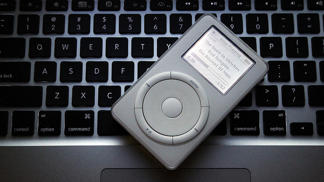
This strategy works best for products where the user interface is the most important feature. The iPod is a great example of this. From an engineering perspective, there was nothing particularly groundbreaking about the iPod, and indeed many geeks sneered at it when it came out. What the geeks missed was that a portable music player is an extremely personal device whose customers are interacting with it constantly. Getting the UI right is much more important than improving the technical specs of adding features.
By paring the interface down to 5 buttons and a scroll wheel, Apple enabled new customers to learn how to use it in a matter of seconds. The uncluttered, NeXT-derived column view made efficient use of the small screen and provided a consistent visual metaphor across the UI. And by coupling the iPod with its already-excellent iTunes software, Apple was able to offload many functions, like file deletion and playlist creation, onto the user’s PC. You can only achieve this kind of minimalist elegance if a single guy has ultimate authority for the design.
The iPhone also bears the hallmarks of Steve Jobs’s top-down design philosophy. It’s a much more complex device than the iPod, but Apple goes to extraordinary lengths to ensure that every iPhone app “feels” like it was designed by the same guy. They’ve created a visual language that allows experienced iPhone users to tell at a glance how a new application works. As just one example, dozens of applications use the “column view” metaphor popularized by the iPod. The iPhone lacks a hardware back button, but every application puts the software “back” button in exactly the same place on the screen. An iPhone user quickly develops “muscle memory” to automatically click that part of the screen to perform a “back” operation. The decision to use the upper-left-hand corner of the screen (rather than the lower-left, say) was much less important than getting every application to do it the same way.
In short, I don’t think it’s a coincidence that the devices with the most elegant UIs come from a company with a top-down, almost cult-like, corporate culture. In my next post I’ll talk about how Google’s corporate culture shapes its own products.
Update: Reader Gabe points to this excellent 2004 post by John Gruber on the subject of free software usability.


